Visual Identity for Our Streets Chorlton a campaign calling for a greener, safer and more accessible Chorlton.
Part of the identity package included the design of a number of characters that represent different sectors of the Chorlton community that the project is seeking to serve and reach out to.
An emblem was also designed as part of this creative package for Our Chorlton, the wider project Our Streets Chorlton fits within.
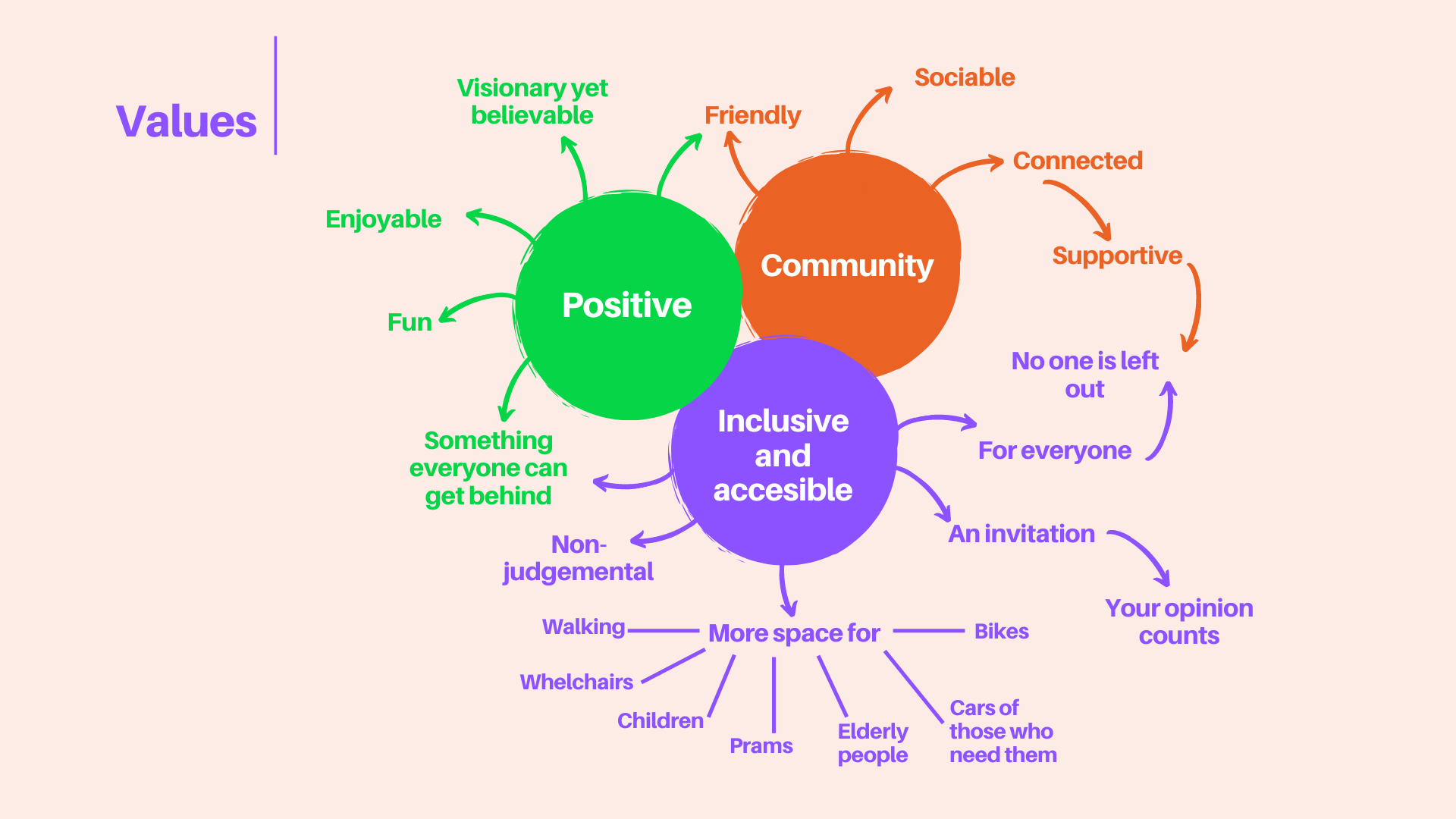
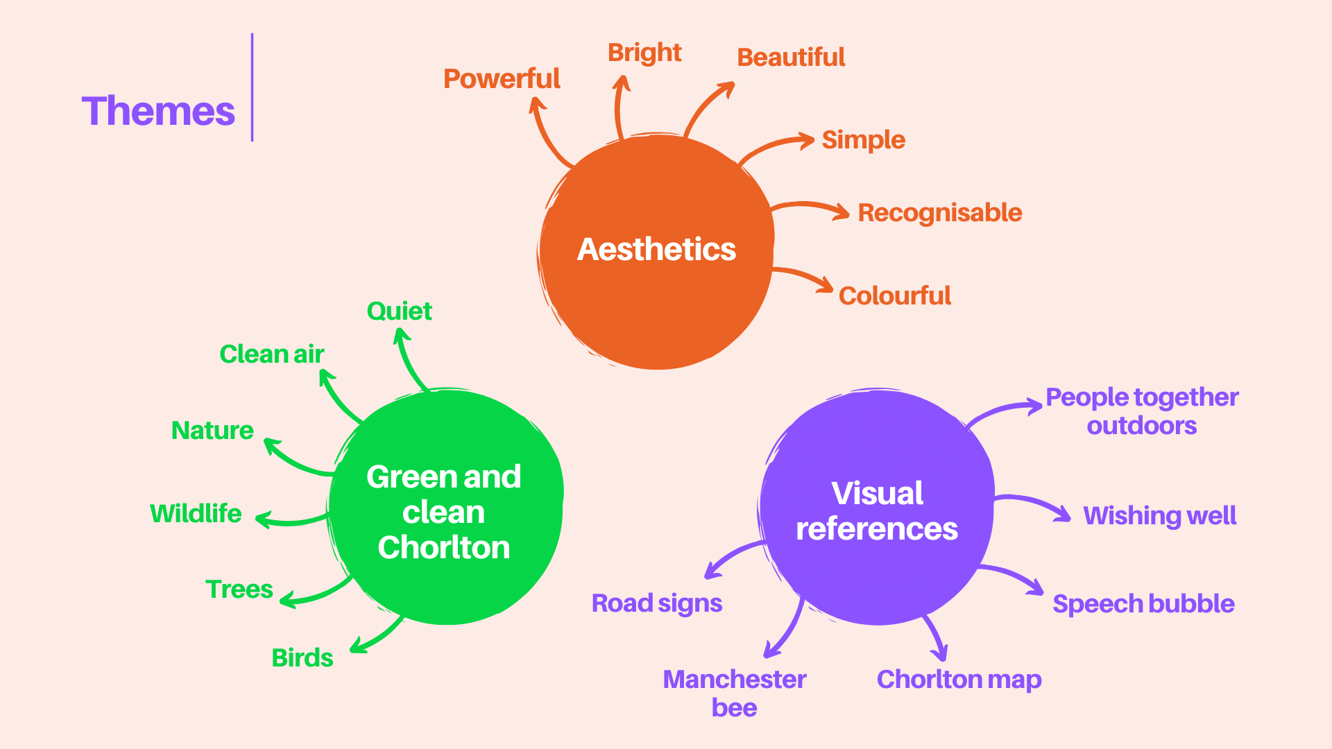
Community participation was key to the development of this identity. As part of the services delivered, I ran two creative workshops with people invited by the Our Chorlton team. The objective of these workshops was to involve members of the community who the project is seeking to serve, to have a voice and help shape what the identity should communicate and look like. Values, themes and design directions emerged from these workshops and formed the basis for the designs. Community members were also invited to provide feedback and vote on their favourite design direction. You can read more about the process here.
